
May 11, 2016
6 Principles of Kitchen Design
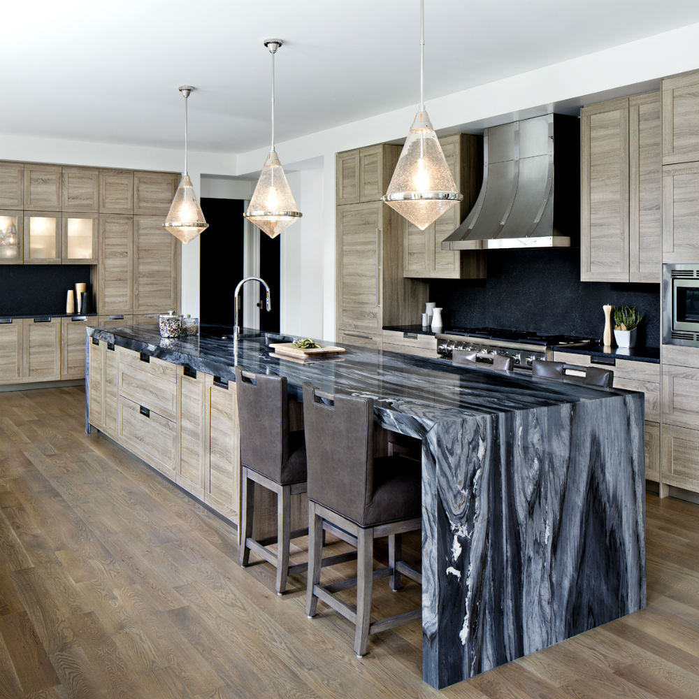
No matter personal style preferences and the existing space one has to work with, you can create an aesthetically engaging kitchen if you let the following six principles of design guide your choices. Though all projects are unique, relying on these key principles are essential in creating a composition that is beautiful as it is efficient.
KITCHEN DESIGN PRINCIPLE #1: RHYTHM
Rhythm is the reoccurrence of specific design elements that create movement throughout an interior space. It should keep the eye moving through the room and make the space feel balanced and unified.
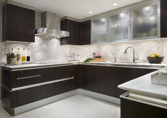
The backsplash in the picture has good rhythm. The cabinetry is very linear, so the small square mosaic from Artistic Tile complements the rectilinear shapes found elsewhere in the kitchen. It’s made up of 4 different colors and materials, and each is balanced in such a way that it creates a staccato rhythm that unifies each elevation in the kitchen as one whole. The rectangular frosted glass doors also produce rhythm over the sink and assist in creating the next principle, emphasis.
KITCHEN DESIGN PRINCIPLE #2: EMPHASIS
Emphasis is the focal point of the design that catches the viewer’s attention. You create emphasis in a room using scale, color, texture, shape, light – basically any method that will call attention to a design feature. In kitchens, there are usually several opportunities for emphasis; both decorative and functional.
In our example, the illuminated glass wall units above the sink emphasize the sink area, which is the center of the room, and provide additional light to the kitchen and main prep area. The secondary emphasis is the hood, which was created through lighting, material change, and space.
KITCHEN DESIGN PRINCIPLE #3: HARMONY
Harmony is how all the different elements in one space come together to form a single composition. This is especially important in kitchens because there are so many different parts and materials included in one space. Cabinetry, appliances, countertops, backsplashes, flooring, countertop appliances, accessories, and window treatments: all of these elements are very different yet need to blend together harmoniously so the room doesn’t feel busy or disconnected. It’s not that everything should be made of one material or match exactly, but the key is to blend and complement all of the materials with one another.
In the picture, notice how the stainless steel appliances complement the aluminum trim on the cabinetry, which in turn is balanced by the silver frame of the glass wall units. The stark white top is softened by the neutrals and taupes in the mosaic backsplash and the soft grey floor finish (which also complements the mosaic). Accessories are kept simple and free of bright accents which would otherwise call attention away from the composition as a whole.
KITCHEN DESIGN PRINCIPLE #4: BALANCE
Balance is the even distribution of visual weight. You can use color, texture, form, and space to help achieve balance in a room.
As an example, this U-shaped kitchen is open on one side, so the glass cabinetry that I used on the opposite wall balances the open space and keeps the area over the sink from appearing too dark or heavy. Otherwise, the contrast could have given you the impression of being in a very dark dreary corner. I also used the lighter finishes on the countertop, backsplash, and floor to balance the drama of the dark, rich cabinetry. This is an example of using emphasis to create balance. The negative and positive space that is created using these “tricks” makes the user feel more comfortable in the space.
KITCHEN DESIGN PRINCIPLE #5-6: SCALE & PROPORTION
Scale and proportion go hand in hand and refer to the physical size of the space and how objects relate to one another in a room. The scale is typically determined by the architecture, so everything must be proportionate to that element.
The ceiling height in this condo kitchen is low, just over 7’-0”, so the cabinetry had to adjust to this scale to avoid overpowering the room and appearing as though it didn’t fit or was forced in. If you don’t honor the scale, you can make the contents, and the room itself, appear odd and uncomfortable to be in. Once again, the glass cabinetry and light tops keep the room light and bright, otherwise you risk having the dark wood dominate the small space, thus making it feel smaller than it is. By keeping the horizon level light, it tricks the eye into giving you the perception of more space.